Voxeon Communications
Turning a whispering PR brand into one that shouts
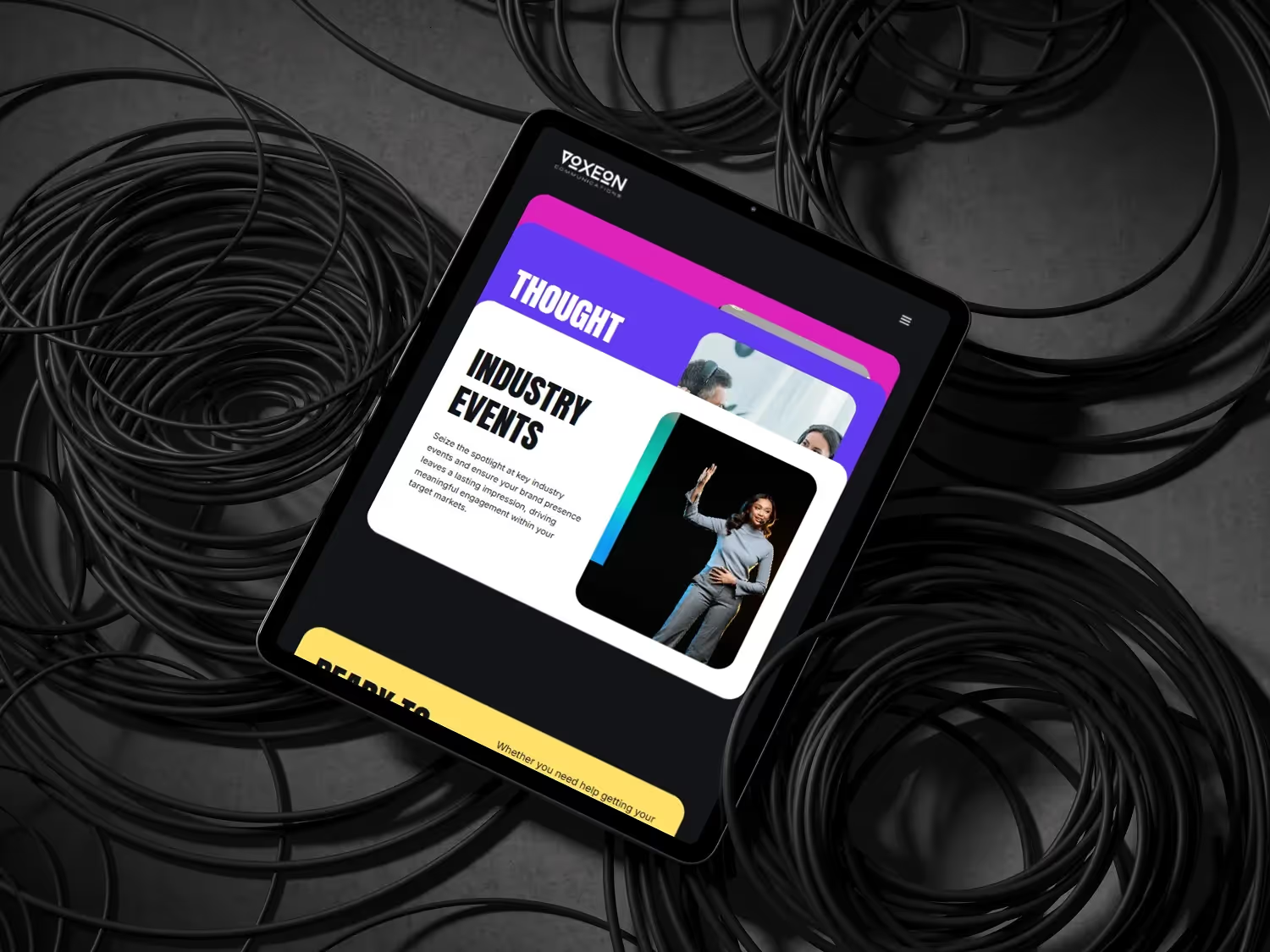
Industry
Public Relations
Timeline
4 weeks
Services
Web Design, Webflow Development, CMS Architecture
Overview
Voxeon had a strong visual identity — dark palette, bold typography, purple accents — but their site wasn't using any of it to its potential. The messaging was cautious, the layout safe. For a PR agency whose product is powerful communication, that disconnect was actively costing them business.
The Challenge
Voxeon's fractional PR model — their key differentiator — wasn't explained on the site. Prospects arrived at meetings confused about what they were buying. The 'good guys' positioning wasn't visible, and the visual identity had implementation issues: poor contrast ratios, overused accent colour, inconsistent typographic hierarchy.
Our Approach
Forensic audit of the existing brand implementation. Contrast ratios fixed throughout. Purple accent reserved for specific functions only — CTAs, key data, selected emphasis — restoring its visual significance. The fractional model given prominent homepage placement with plain-language explanation. CMS structured for easy content publishing.
Results
Here's what the project delivered — measurable outcomes that speak for themselves.
Meeting Quality
Prospects pre-informed
Client Self-Selection
Right-fit inbound up
Publishing Cadence
Monthly → Weekly
Build Time
4 weeks
Frequently asked questions
Common questions about the Voxeon Communications project.
More work
View all case studies
Want results like these?
Let's discuss how we can build something exceptional for your brand.